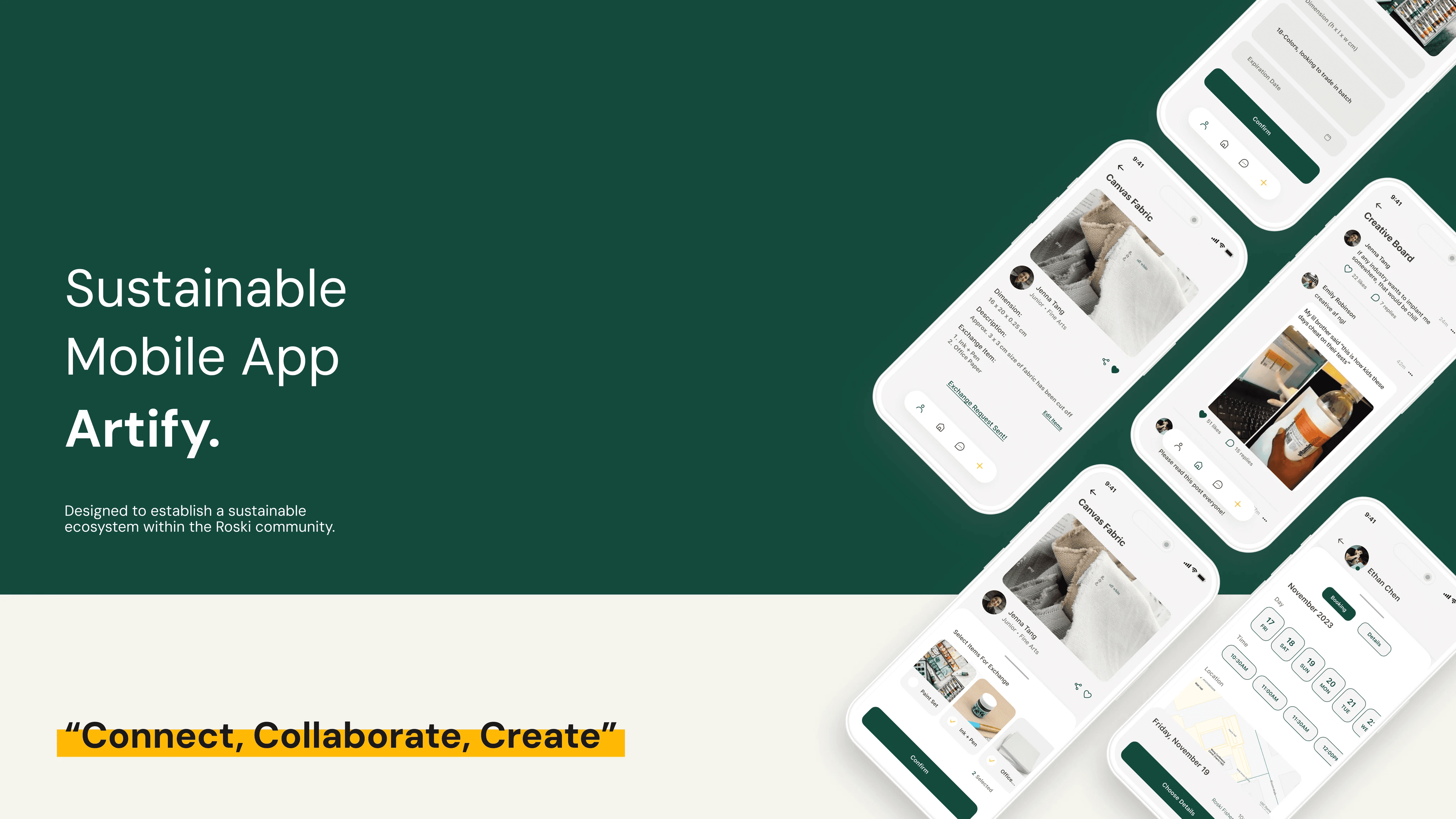
Artify is a sustainable mobile app tailored for art students at USC Roski School of Art and Design, promoting sustainability by connecting students to exchange surplus art materials, fostering an eco-friendly and collaborative community.
The Problem
Roski students tend to purchase art supplies in large quantities as a preemptive measure against frequent buying, resulting in excess materials and waste.
This practice not only places a financial strain on students but also poses an environmental challenge, contradicting the school’s sustainability objectives. The accumulation of excess art materials reflects a need for a more mindful and sustainable approach to resource utilisation within the Roski community. Addressing this issue could promote responsibility and align with the broader ecological aspirations of the institution.
The Research
Research methods included:
Survey (Qualtrics)
Interviews with target audience (USC students)
4 Hypothetical User Personas
Research Takeaways
Research Takeaways
Through the survey results, user personas and competitor analysis, the three major characteristics of ‘Artify’ were narrowed down to exchange, sustainability, and rewards.
Exchange would be the method of communication and material transferral, sustainability would be the purpose of the app, and rewards would be the attraction feature for users to actively participate.
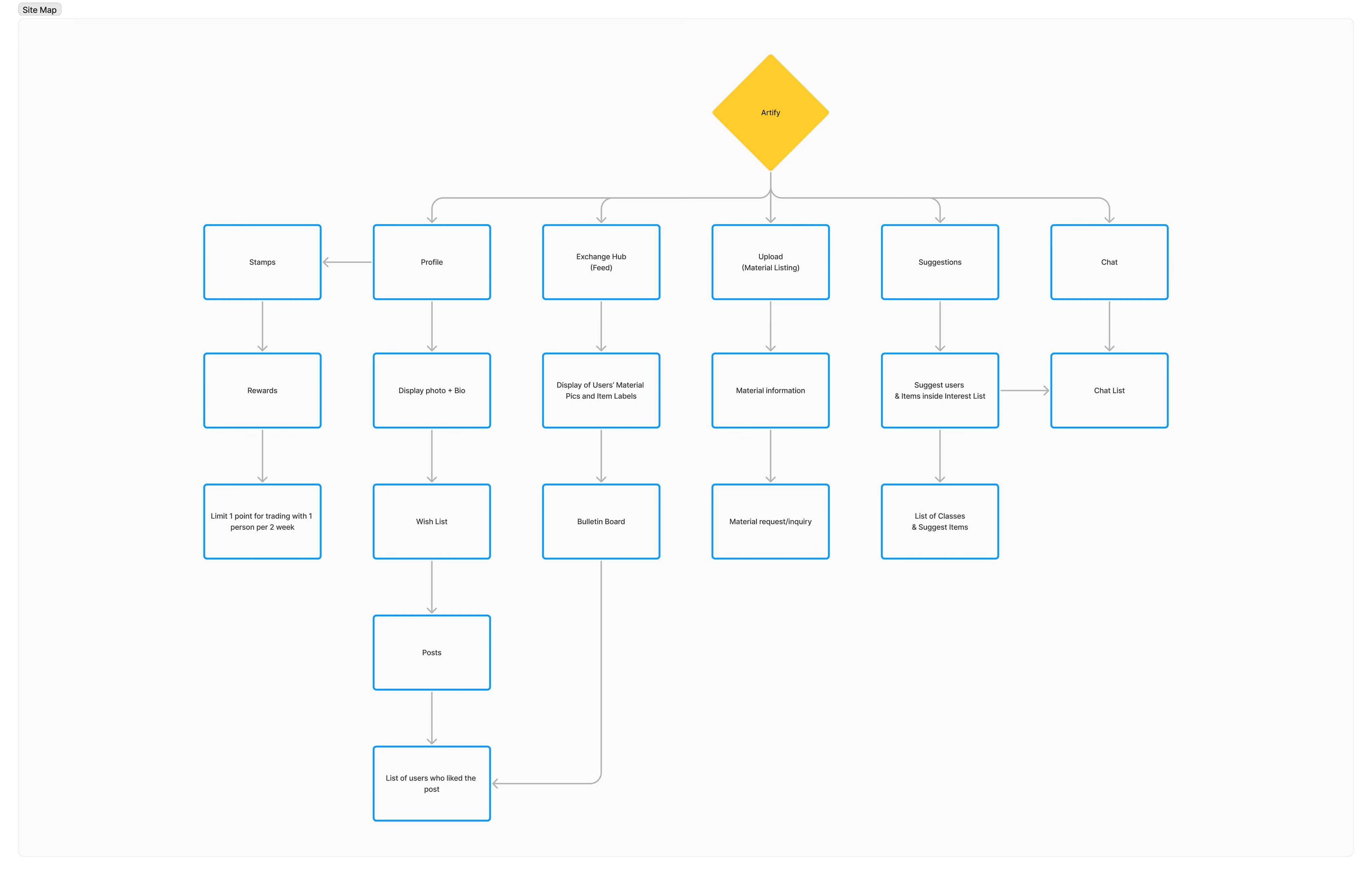
Site Map
Features of Artify organised into a map, to clearly see how each page of the app will connect.
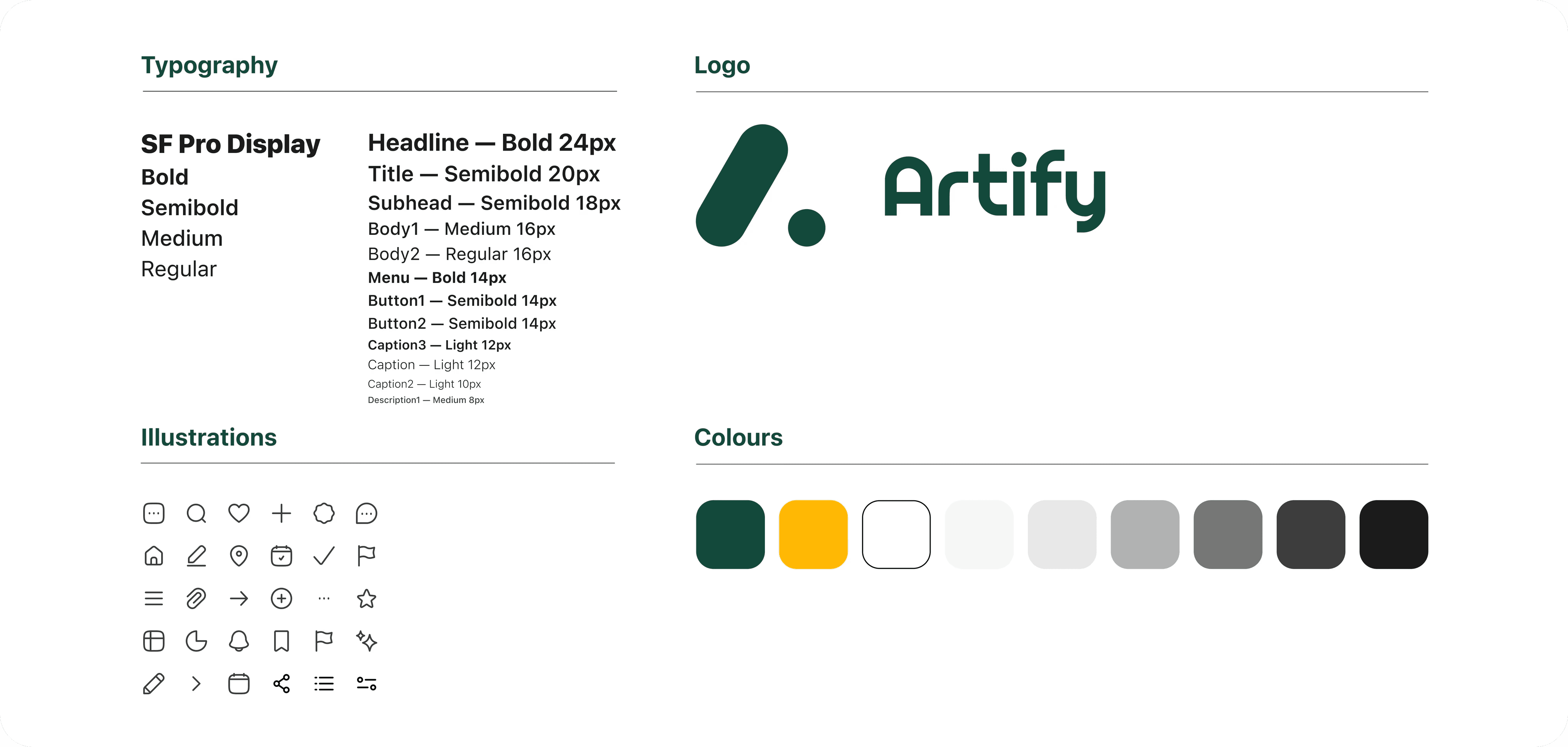
Design System
Artify’s design system embodies minimalism and cleanliness, featuring a sleek interface. The use of dark green evokes sustainability, fostering a connection to nature while maintaining a modern, eco-conscious aesthetic.
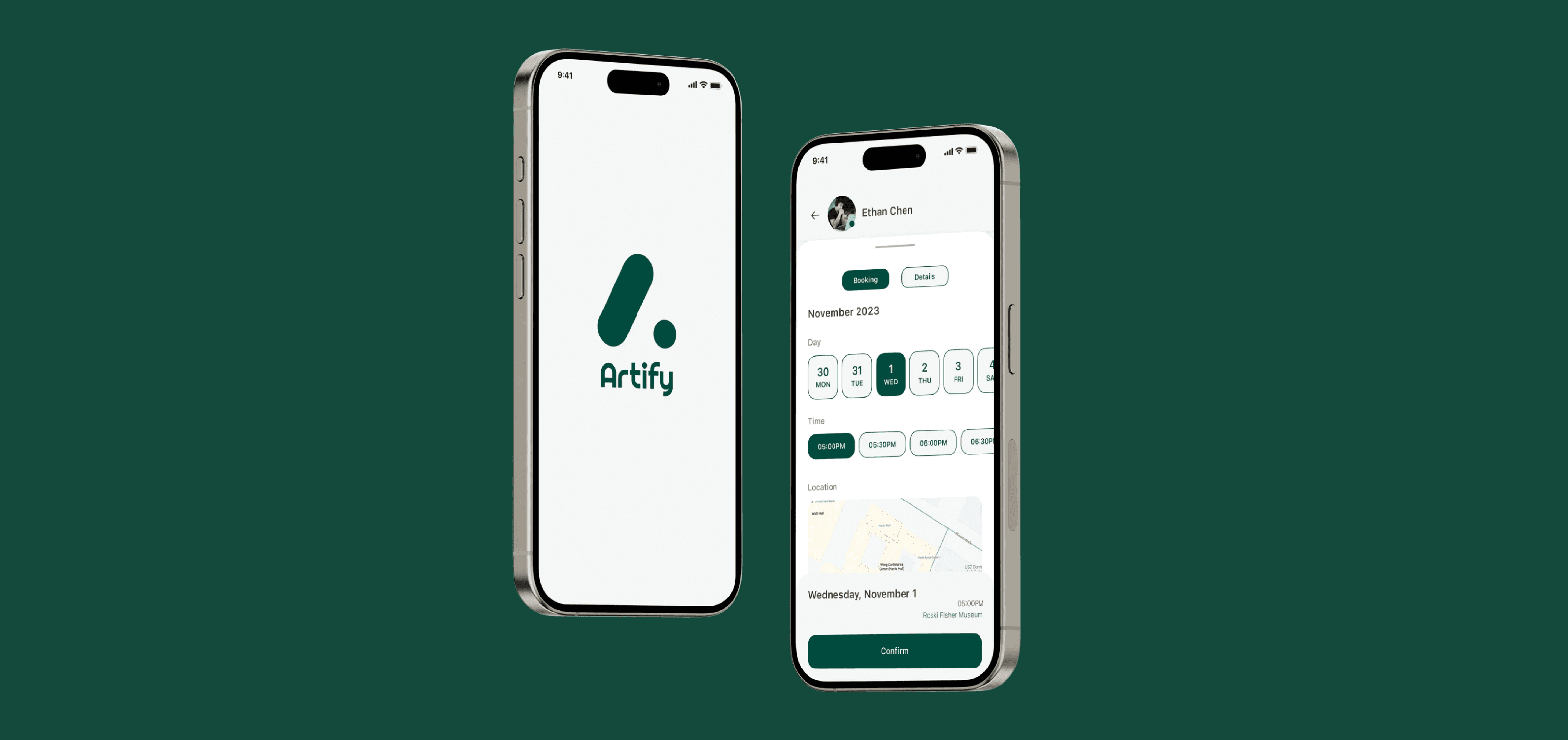
Final Product
We successfully created a prototype considering simplicity and providing users with an intuitive and uncomplicated interface that minimised unnecessary complexities.
The design facilitated efficient storytelling by providing a seamless progression of the user journey, allowing for a clear and coherent narrative. Iconography was clear and simple so that the users would not have to second-guess themselves when proceeding through the app.